
EGA and Me:
A Complicated Relationship
Posted on August 6, 2026
In 1992 I bought my first PC, a 386 SX clocked at 25 MHz with a 50 MB hard drive. It had a VGA graphics card that allowed 256 colors to be displayed on the screen at the same time.
After years of the same 16 colors on my C64, this was a revelation.
My PC came with a few games, including

However, I also encountered games that only supported EGA, and they felt like a step backwards. EGA's saturated colors made everything look terribly garish, and people's faces looked either very pale or dangerously sunburned.
Thus I developed an early dislike for the EGA palette and convinced myself that games in VGA were simply superior.
Over the years, I learned to appreciate the art of working with a limited color palette. What I once saw as an annoying technical restriction now served as a source of inspiration. I realized that working with the limitations instead of against them not only made life easier, but also produced better results. Pixel art doesn't get better just by throwing more colors at it.

Eventually, I went back to the C64's palette and started making graphics using its 16 colors. For a while, I was still rather dismissive of EGA's saturated color palette, preferring the more muted tones of the C64.
Even in my first blog post on
Soon after, my attitude began to change. One factor was Mark Ferrari's 2016 GDC talk, in which he recounted his early days at LucasArts (then Lucasfilm Games), when EGA was the de facto standard for PC games.
"Those 16 colors were arrived at by well-intentioned programmers who simply slid the RGB numbers to even intervals and said 'Look, how symmetrical, how balanced, we're done.' And the rest of us were left to do the crying and the cleanup."Mark Ferrari on the color choices of the EGA palette
He described how Lucasfilm Games' artists had to fight to get dithering into their games.
Up until that point, the EGA backgrounds of their adventure titles (

This prompted me to compare the EGA and VGA versions of
By comparison, the VGA backgrounds, while not bad by any means, sometimes seemed a bit aimless in their coloring and unsure of their light sources.

I also delved into Sierra On-Line's catalog of EGA games, of which I'd like to highlight
I love this close-up view of the elevator controls. It's such a minor part of the game, but the artist went out of their way to make it look good.
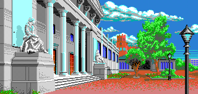
After having done some C64 pixel art for a while, I eventually warmed up to the idea of trying another well-known retro palette.
Around that time, I also had the idea to create a point-and-click adventure game in the style of an EGA-era DOS game.
Eventually, after a few concepts that didn't pan out, I came up with
Making a game always gives me an excellent excuse (and motivation) to draw pixel art. The more I worked with the EGA palette, the more I warmed to its crazy colors.

However, as I became familiar with the colors, I also began to notice some awkward relationships between them. Light gray and light red, for example, are so close in brightness that I always doubt myself when I want to use the former as a highlight for the latter. Brown and green, which are also annoyingly close in brightness, make it hard for me to decide which should be the lighter color. It doesn't help that the colors look slightly different on different monitors.

Nevertheless, working with the EGA palette has been a very positive and interesting experience so far. The saturation is wild, and getting any subtle hues out of it requires extensive dithering.
But restricting myself to a limited color palette, even if it's EGA, takes a lot of decisions off my back. There are still moments when I struggle to select the right color, but with fewer options, I eventually have to just pick one and go with it.